Personal typography
Originally created for a graphic design class, I analyzed typography and created some business cards to represent me.
Final Designs
Here are the polished final logos I made for this project:

1

2
Personal Reflection
Explain your idea - What are you connecting to??? (Inspiration/Career/Life)
I wanted to make a professional looking business card. I felt a scifi-y format looked best so I made my grey and dark grey business card.
Explain your creativity - How is your work original to you? (RIP OFF vs. REMIX)
My methodology for making new graphic designs seems to involve making a whole lot of iterations of designs and then start looking at inspiration midway. I believe this helps me to be more original and more personal to myself.
Explain how well you did with your Hierarchy + Design Balance (Does it read easily? Does it feel balanced or imbalanced?)
I believe I did pretty well at making the visual hierarchyl; however, I feel the design might feel a little off balance though. The off balance nature of the business card might be because of the logo feeling bottom heavy.
Explain how well you did with your craftsmanship. (Accurate Text? Edge Alignment? Resolution? Site Layout?)
I used the align tools and direct select tool to ensure my design is centered correctly and not offset. I made my overall site outside of google sites because I enjoy to program, and I believe it looks better and more professional.
Explain why you landed on this final business card as your favorite. (Do you plan on using it? How?)
I landed on this design as the final because I believe it looked the most professional and the most representational of me. I originally tried to make a design that was mostly white as to save printer ink potentially. However, I quickly gave up on those because my darker designs all looked far better. If I need to use this business card, I will need to swap out the information on it to have a personal website for me connected to it I could also modify my current website to fit this purpose.
Illustrator Mockups
Partner Critique
What did they say impressed them and why?
Verily, the inventive ingenuity of the individual doth allow him to forge most singular and exquisite art. He is verily great at the overall design balance as well, He useth all the roles with great effectiveness.
What did they say you could still improve and why?
The general hue and tint mayhap could vary more. Yet, verily, it doth cause me some vexation to critique a matter so trivial, for, on the whole, it is indeed quite pleasing.
How have you done since our last critique with growing in the life skill that you chose?!
I have kept pushing myself and challenging myself because I feel confident while doing the required work. I have learned more skills and developed myself while creating interesting things that go beyond the boundaries of the project requirements.
Here are the WIP illustrator drafts for this project:

1

2

3

4

5

6

7

8
Inspiration
Here are some existing business cards I used for inspiration:
Inspiration folder (Only accessible by WCSD emails)
1

2

3
School Examples
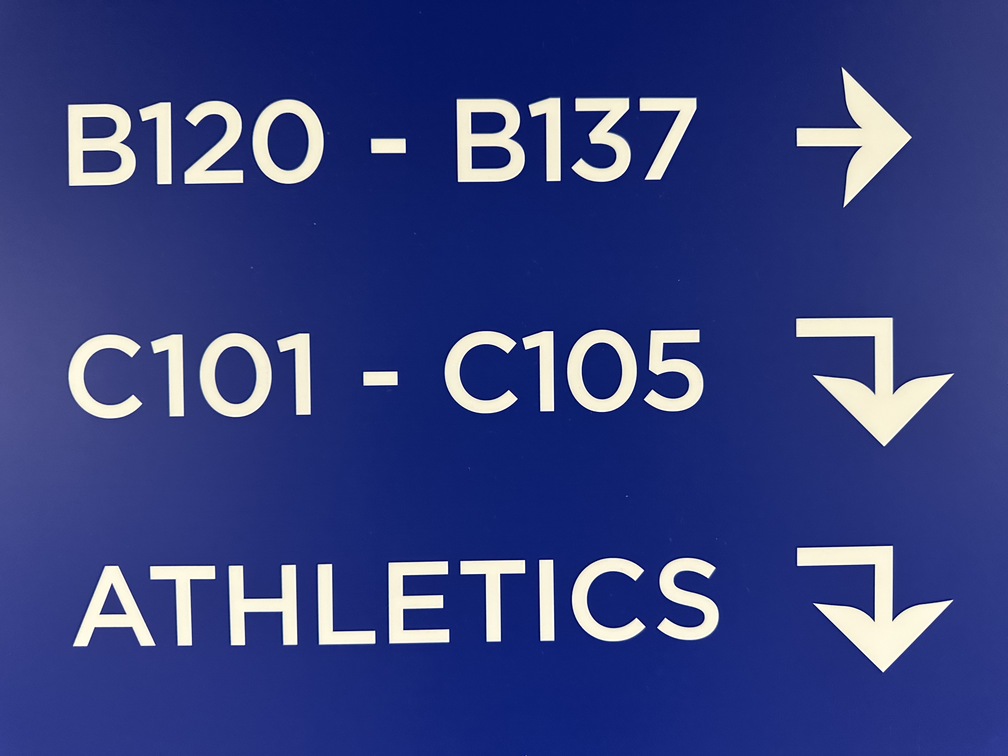
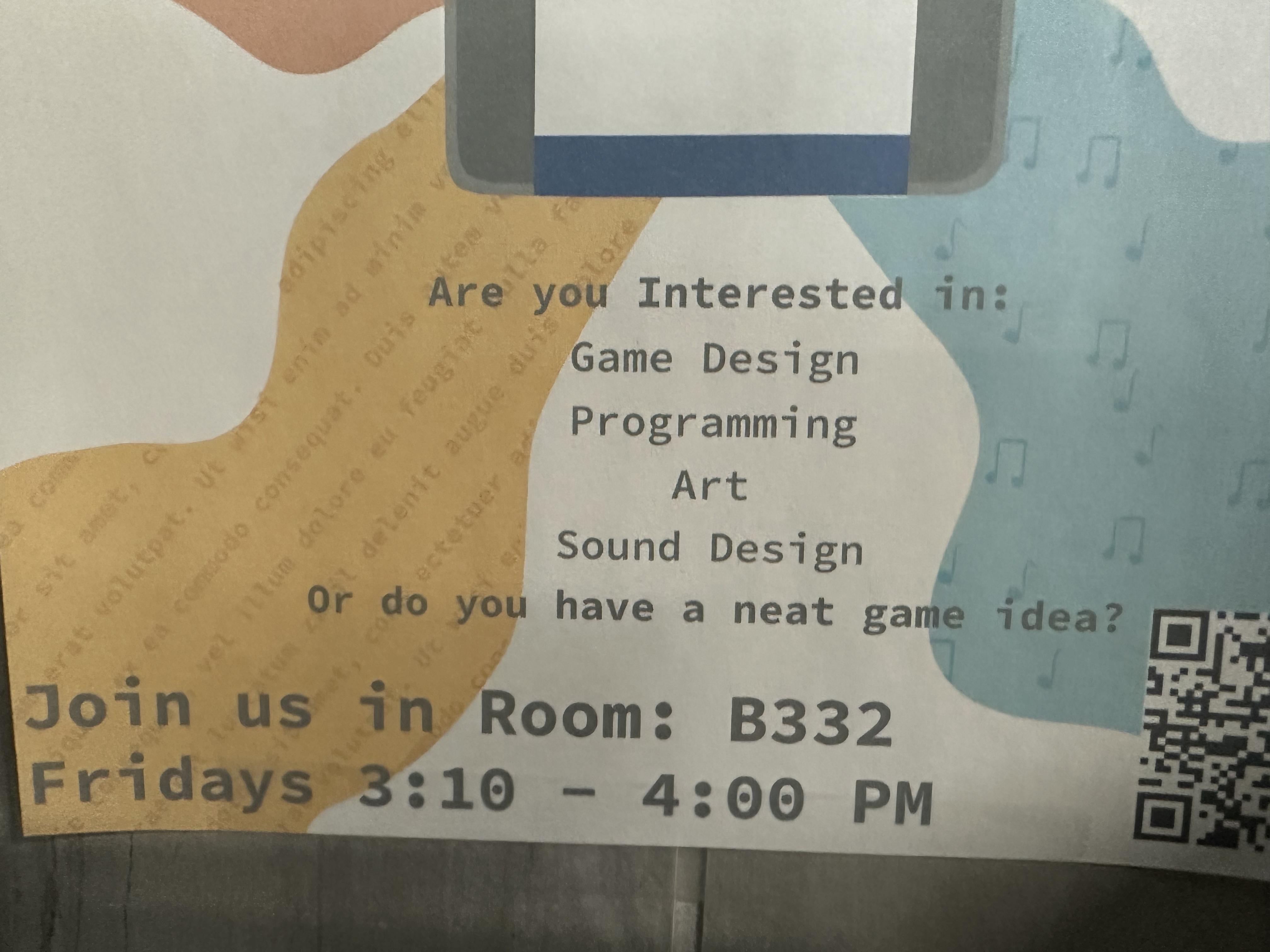
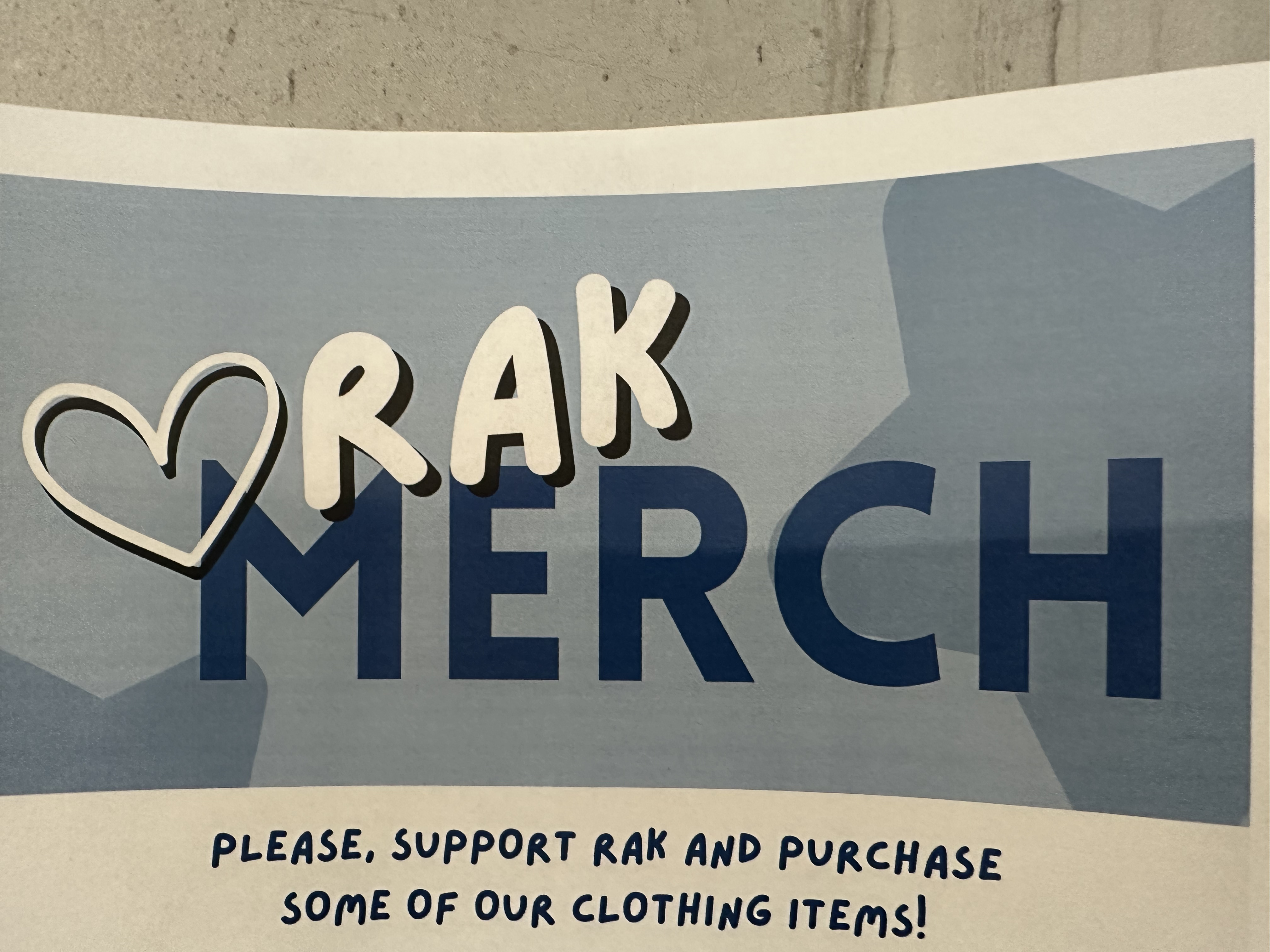
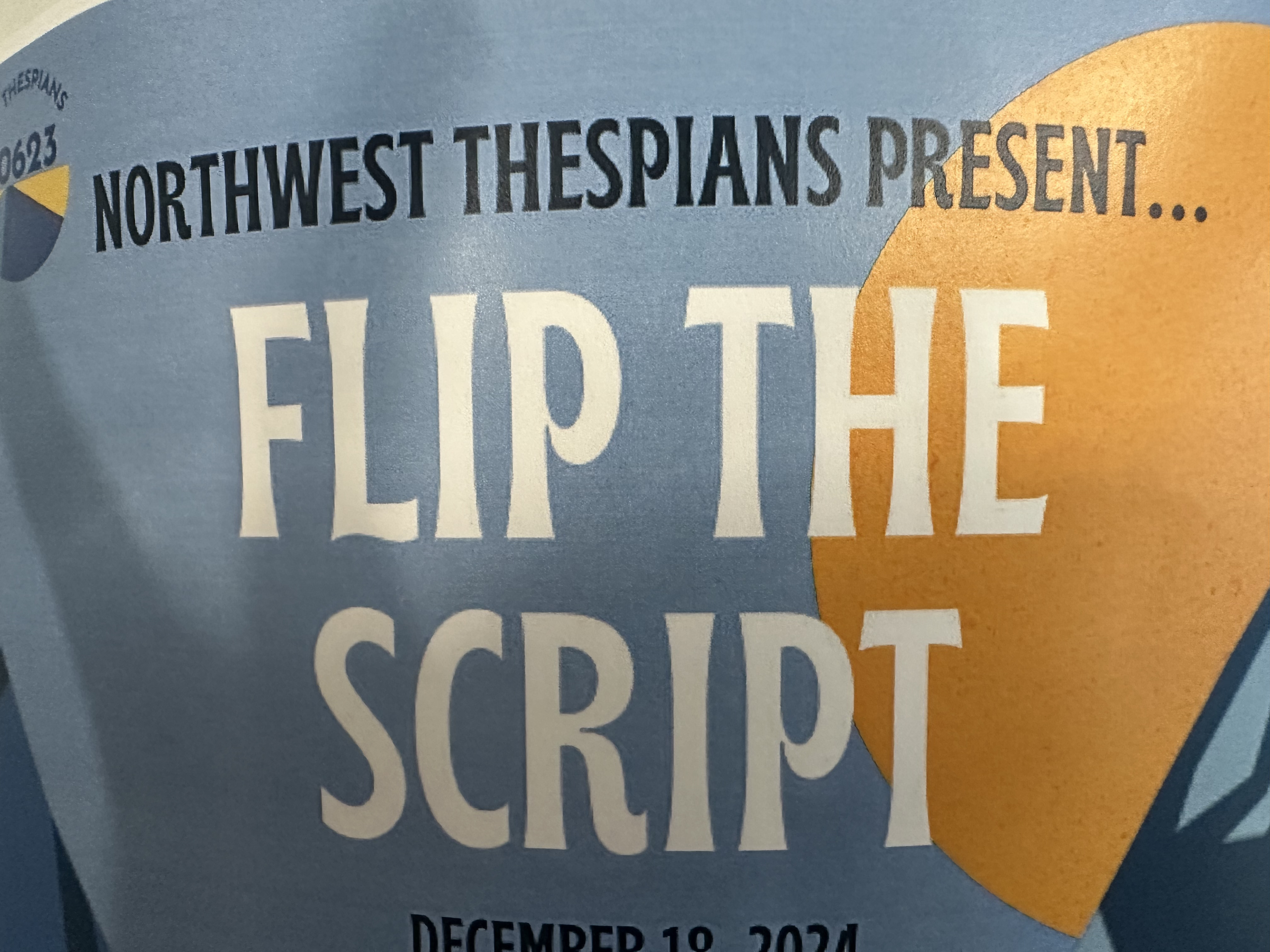
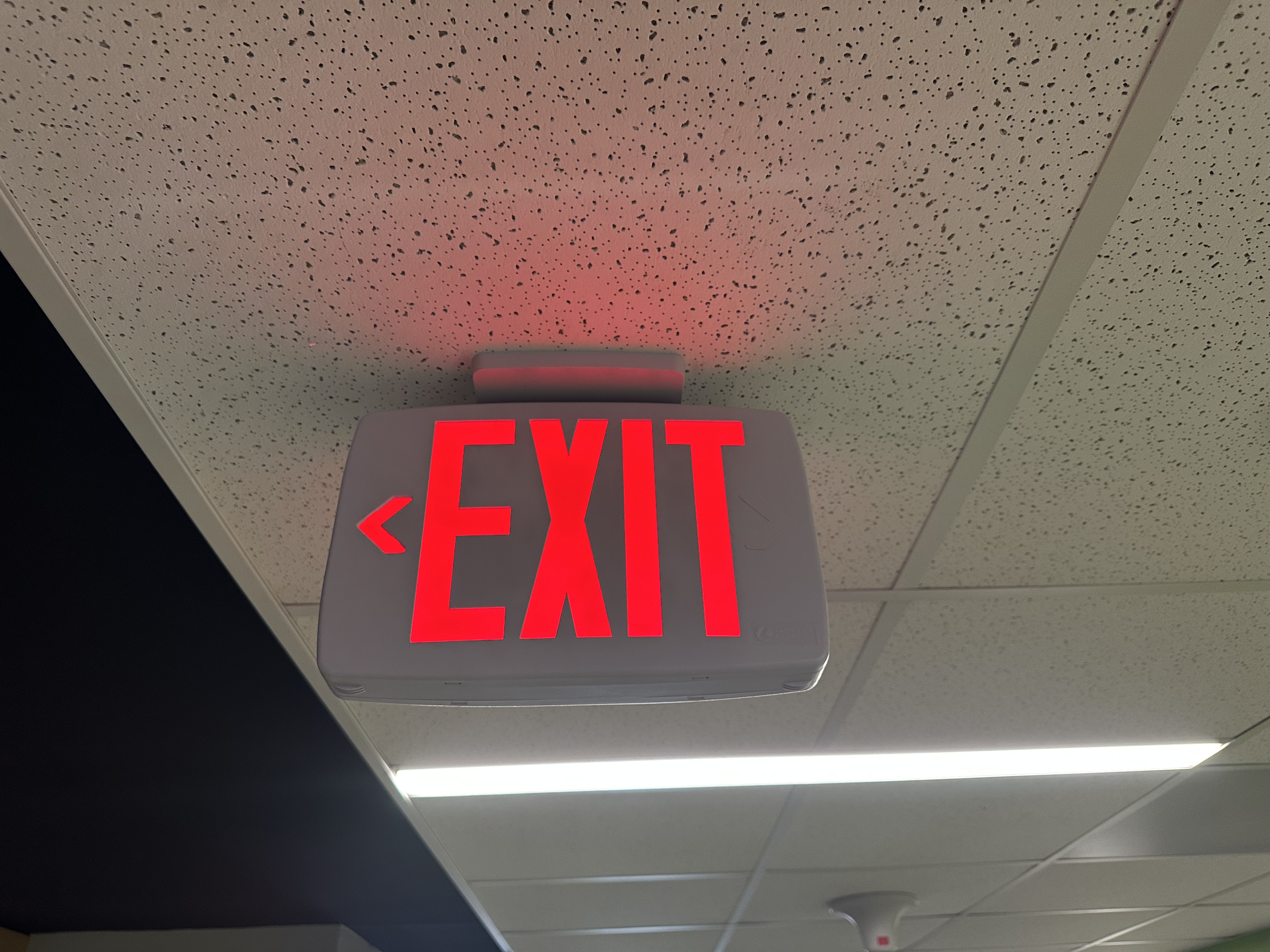
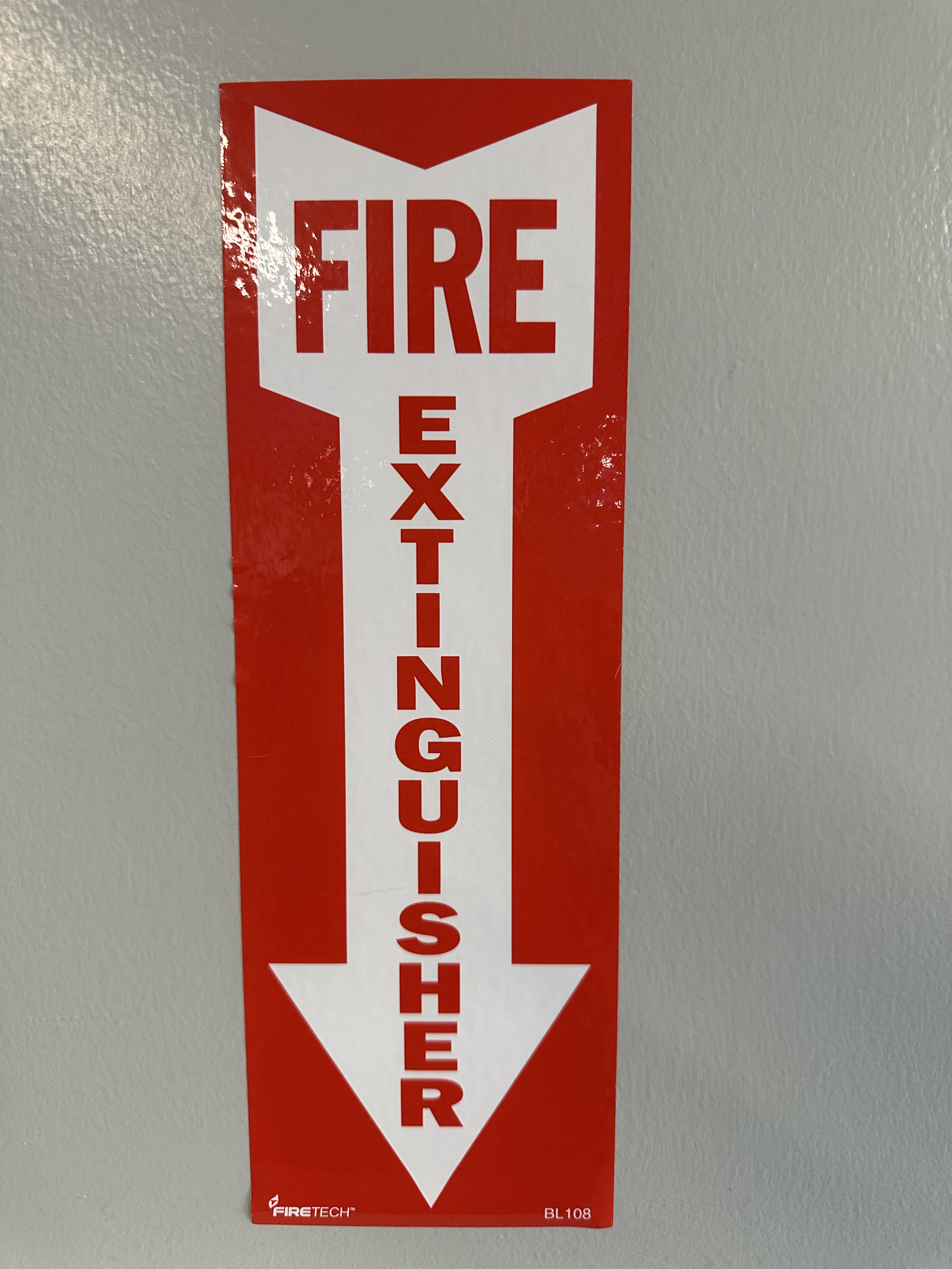
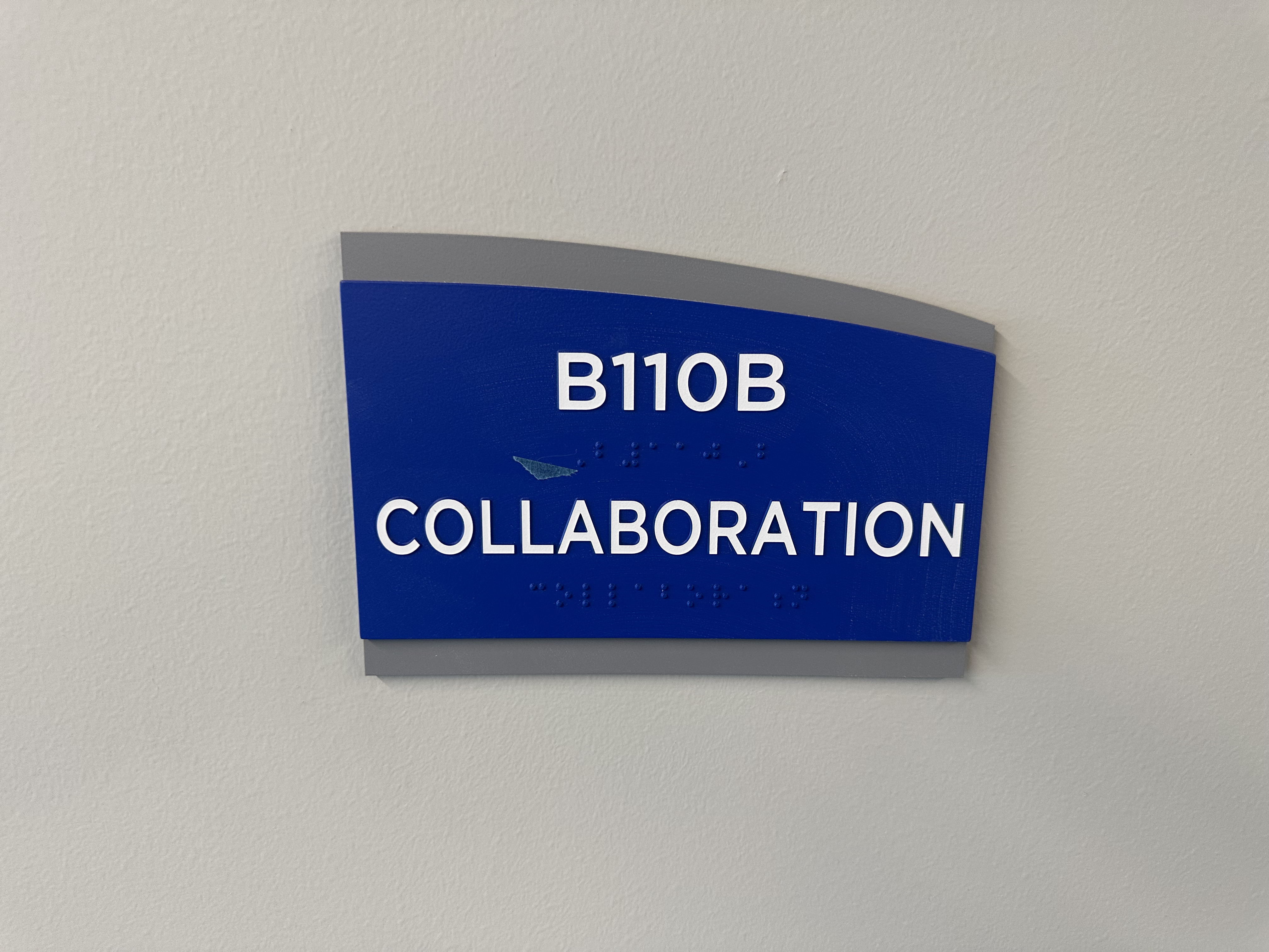
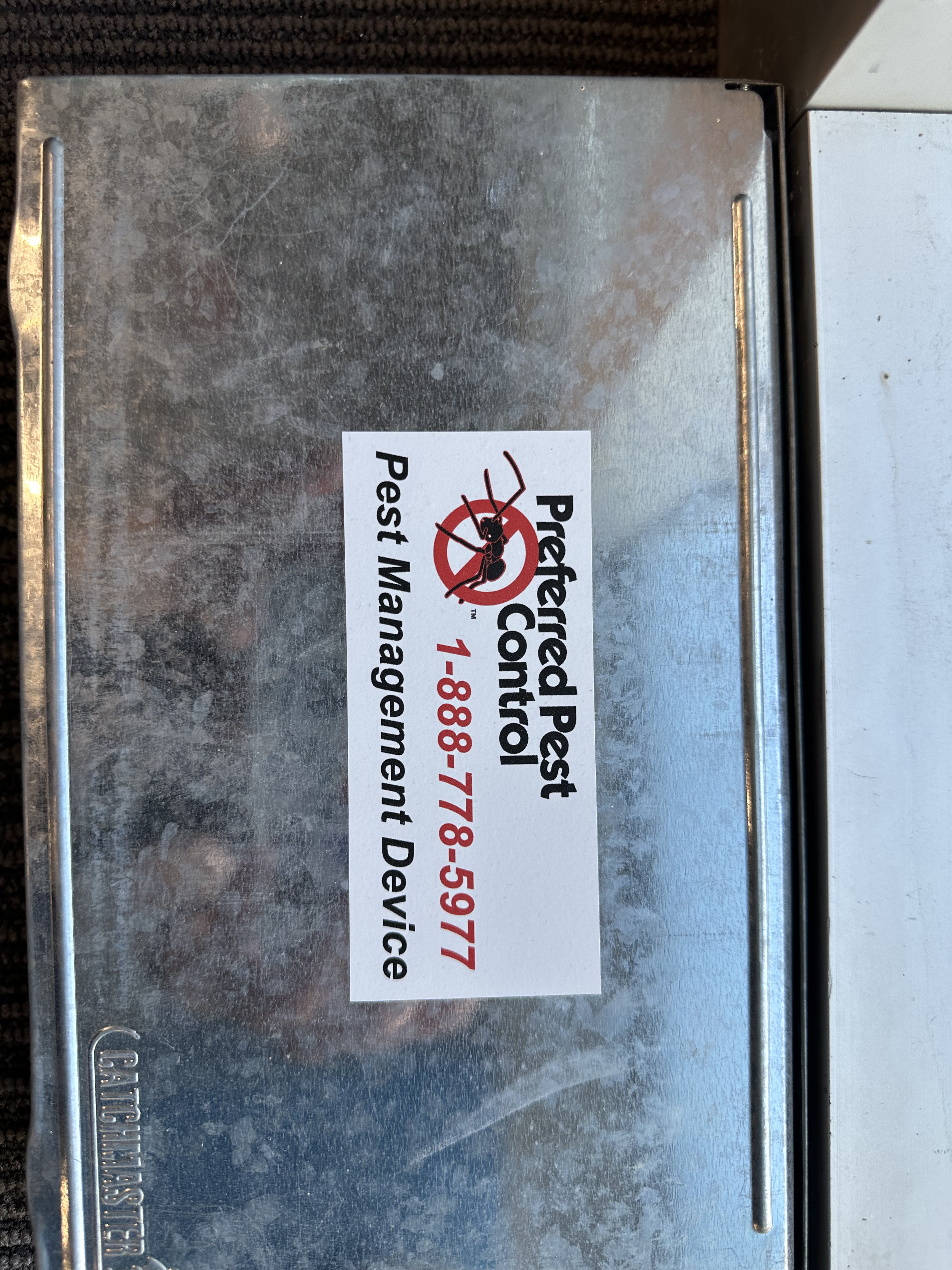
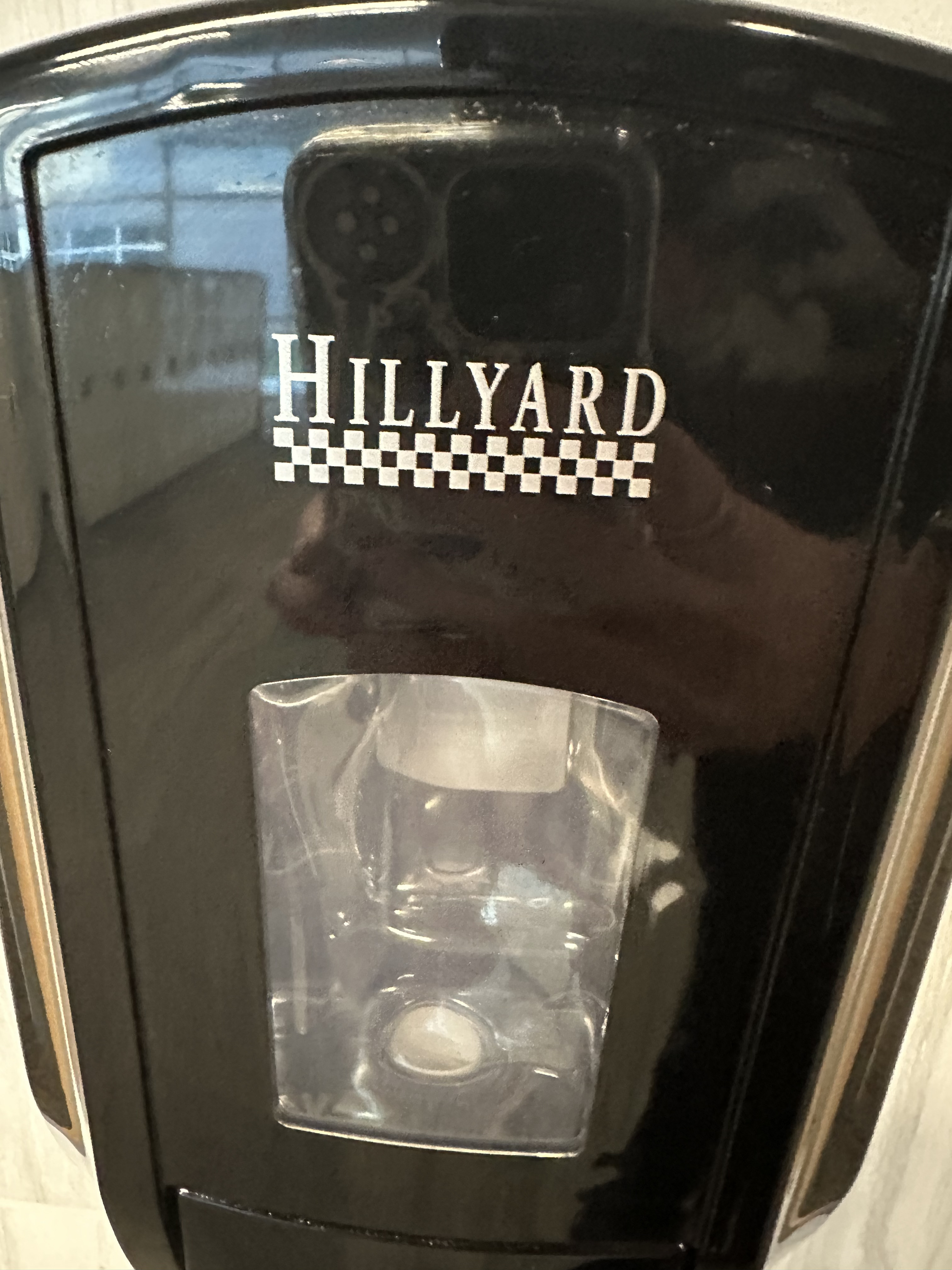
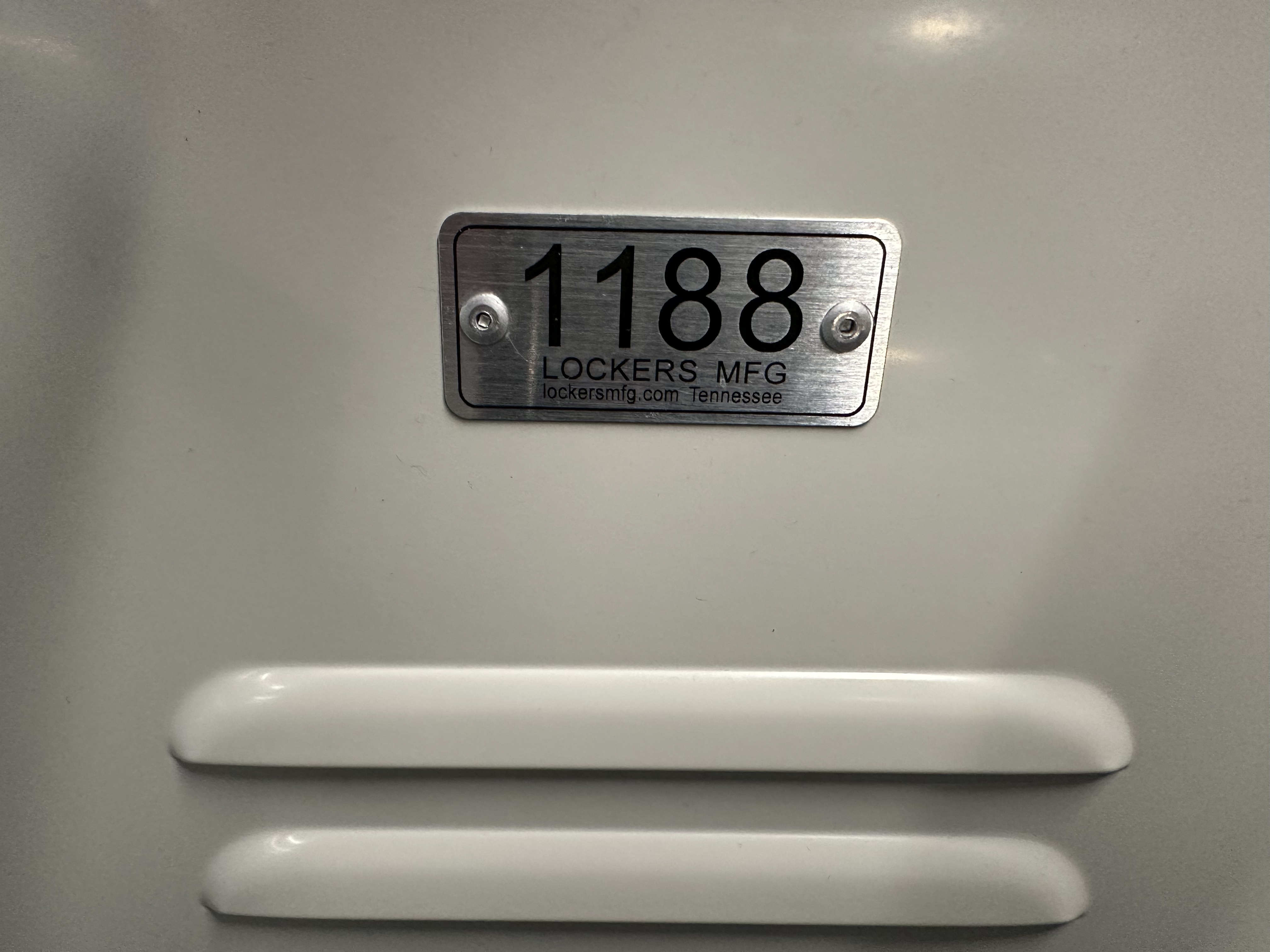
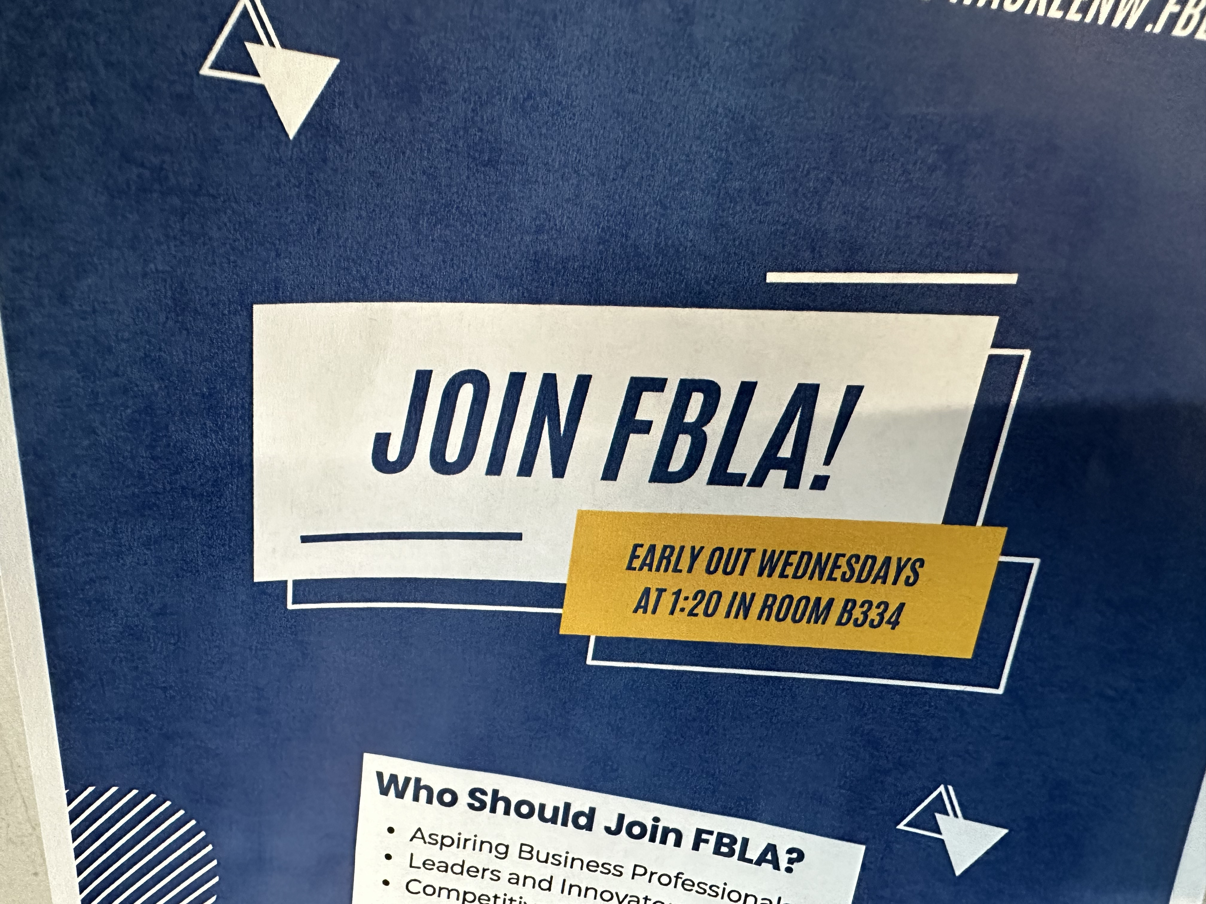
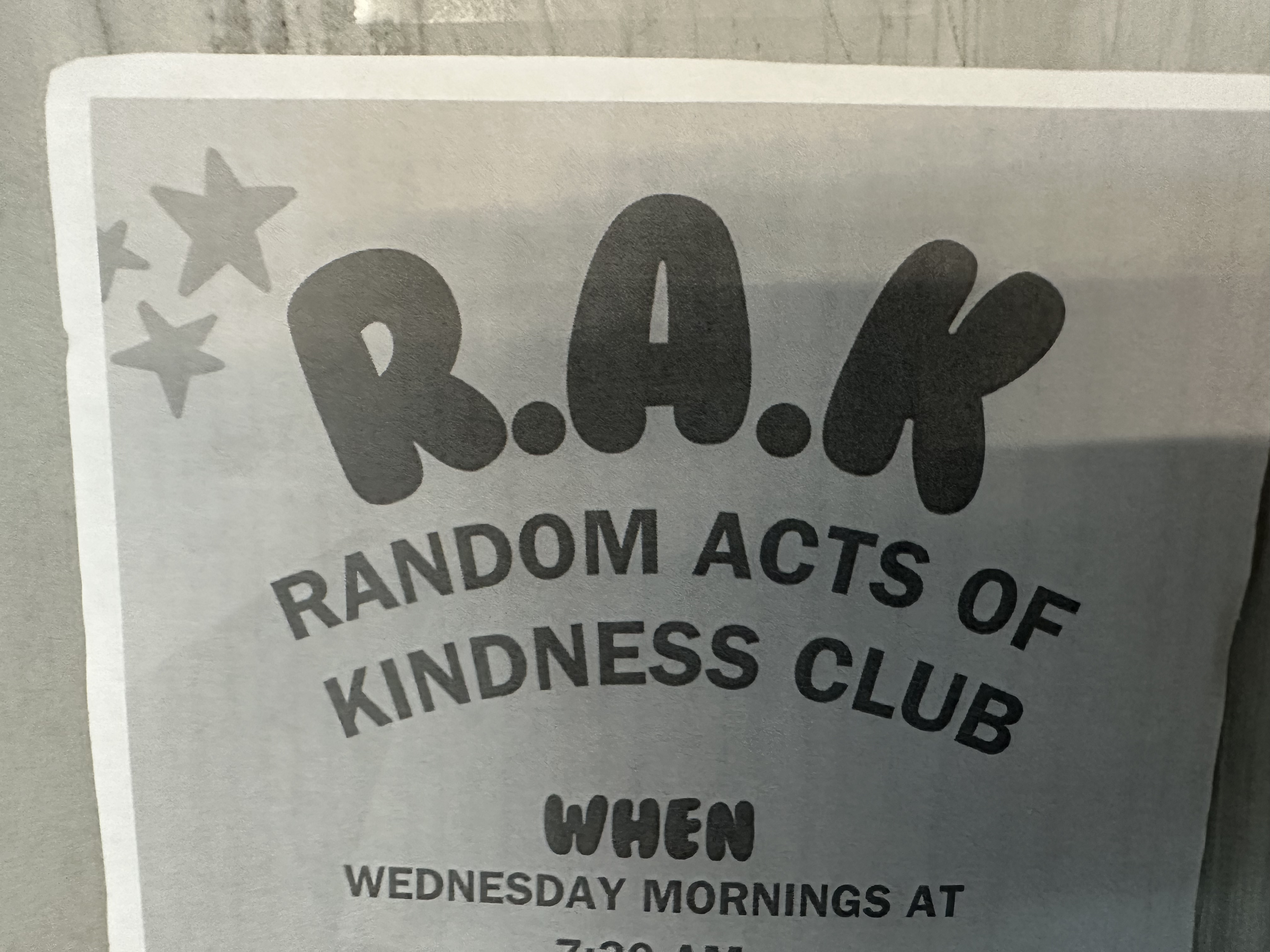
Here are the examples of typography I found around my school:
Inspiration folder (Only accessible by WCSD emails)