Final Design
Originally created for a graphic design class, here is the final project I worked on. These are some posters.
Final Designs
Final Artist Statement
Explain your image choices : Why did you choose this effect and how did you do it?
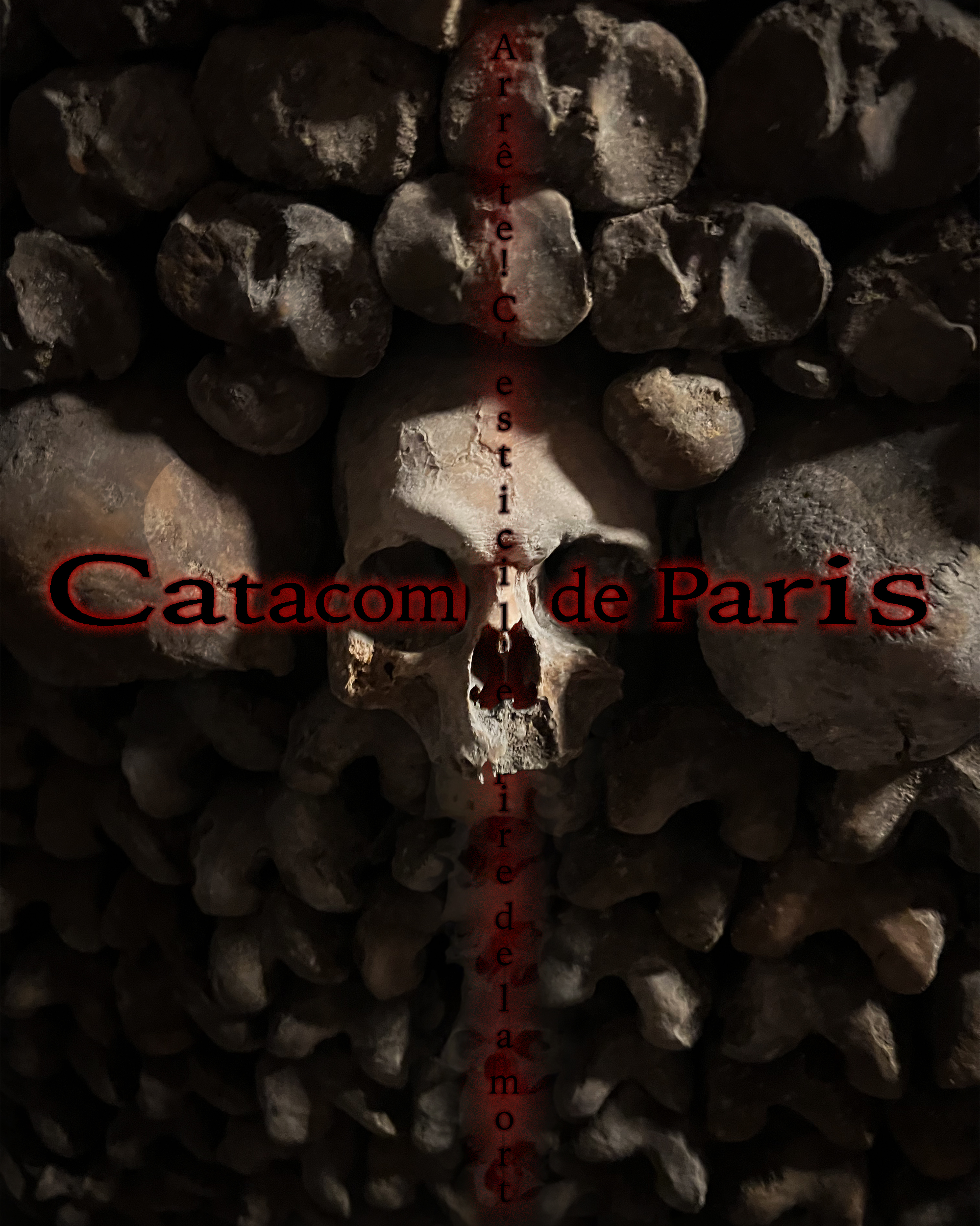
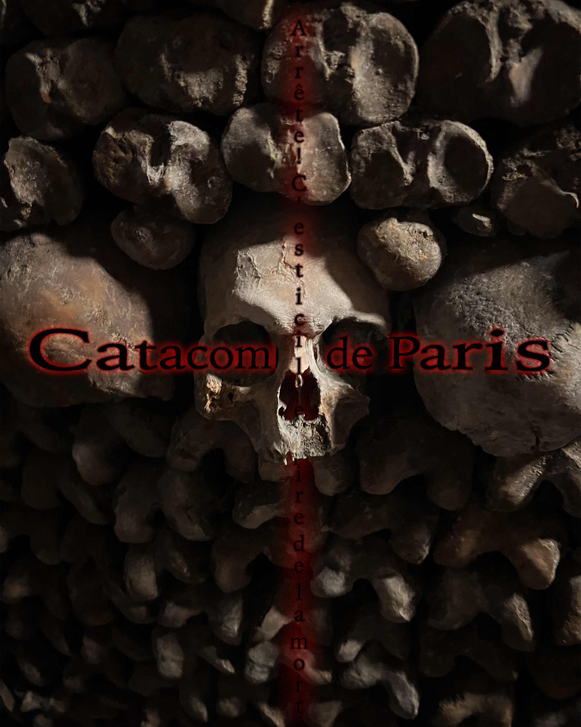
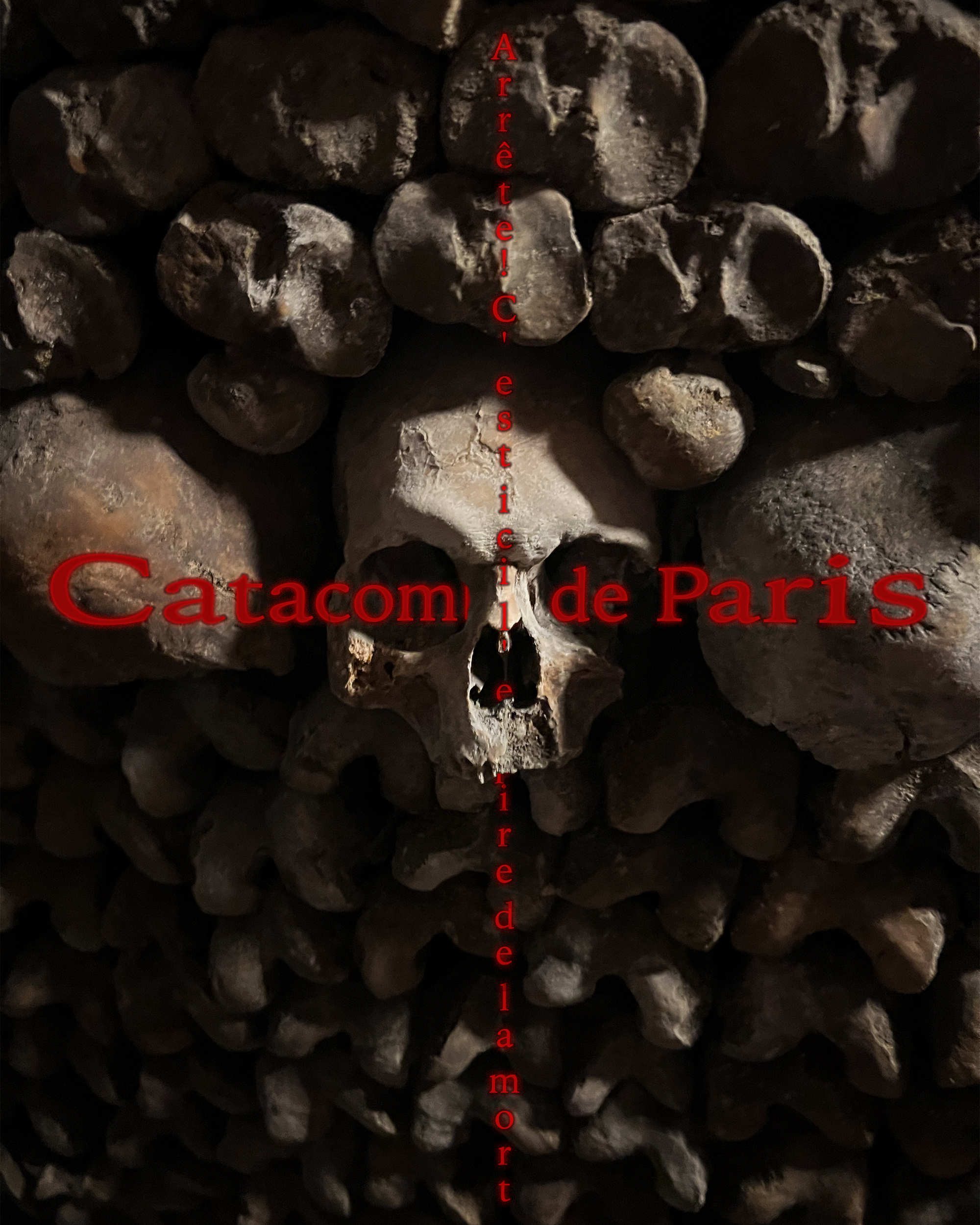
I utilized photos that I took to achieve the impact I desired. Combined with that, I used a gradient mask to make the center of the image brighter and therefore, more emphasized than the edges. At the bottom of the image, I warped and blended another of my images to follow the cross shape of the text.
Explain your typography choices : Why did you choose this effect and how did you do it?
I chose to use a pinch effect combined with layering to create a wrapping-around-the-skull effect. I then used an outer glow to make the text look like a light source. This red glow on the black text inspires a sense of off and ominicity.
Explain your design choices : How did you arrange Elements with Principles to help Composition?
I emphasized the centre skull with gradients of brightness. I arranged the text lines into the shape of a cross because it is a catholic graveyard. I believe my poster is pretty balanced which makes it feel pretty good to look at.
Explain your overall craftsmanship : Are you pleased with the precision of your execution?
I mostly like the poster, but I don't like the blending and inclusion of the other image as much. I quite like how the poster turned out, and I think I crafted it nicely.
What are you LEAST proud of within your design and WHY? We never stop growing!
As I said in the question above, I don't like the other image as much. It crowds the poster and diminishes the authenticity of the main image.
What are you MOST proud of within your design and WHY? Brag about your growth! Celebrate!!!
I like my photography the most because it is authentic to the site I am sort of advertising.
Here are the polished final logos I made for this project:
Final Skull
Refinement Posters
Here are the post-mockup-refinement posters:
DarkTextCat

ShorterText

BetterReadOriginal
OutlinedCat

OriginalCat
Poster Mockups
Class Critique
What did they say impressed them and why?
Personally I like my use of emphasis via contrast to lead the eye towards the central skull. I liked how my text wrapped around the skull too (unique effects). Mr Patton (my teacher) liked the photo I chose for this poster (and I took that photo, so yay) (imagery and craftsmanship).
What did they say you could still improve and why?
I could improve the readability of the title text (readability and typography). This was partially caused by the outer glow being the same color as the internal letters. I could also mess with the text's placement so the word "catacombs" is less covered (readability and typography).
What do you need to lock in on to finish strong by the end of the term?!
I think my application of the taught skills are quite swell, I just need to tweak my Le Chat poster to its final polished state.
Here are the WIP poster drafts:

Le Chat
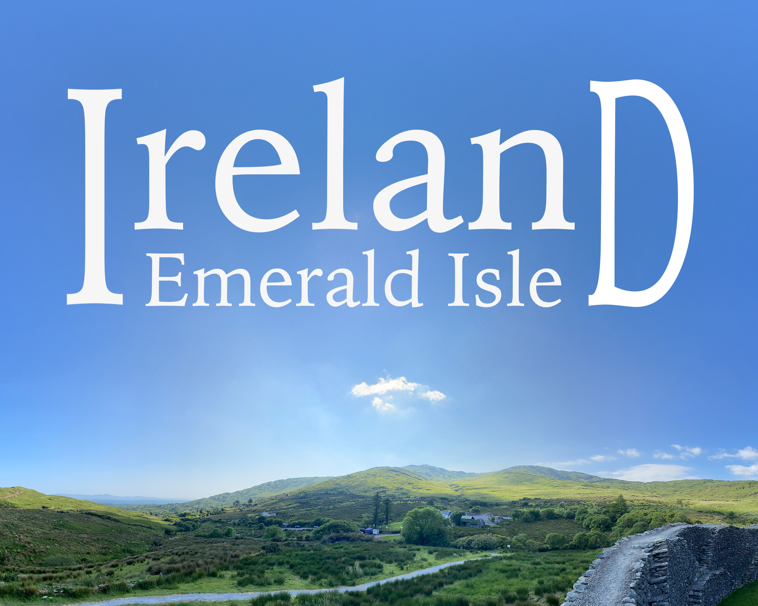
Ireland Post(er)card
Boy
Tutorial Posters
Here are the Tutorial posters:
Glitch
Quilt
OTHER PERSON'S Poster
Here is my favorite poster by a classmate:
How did they do with their technical quality? How well is the design executed in terms of imagery, typography and composition?
I think it is well executed, it looks like a real poster you would see in the wild; it is cohesive and flows nicely.
What creative techniques do you see that they used? What's something they paid attention to that inspires you to refine your own work?
I like the emphasis of the central skull and main title. Their negative coloring on the behind-object text looks cool.
Out of everyone in the class... why did you choose THIS DESIGN? How did it beat others?!
I think theirs is the most realistic and just looks sweet while also conveying a good amount of information about the media it is representing.
Other Person's Poster
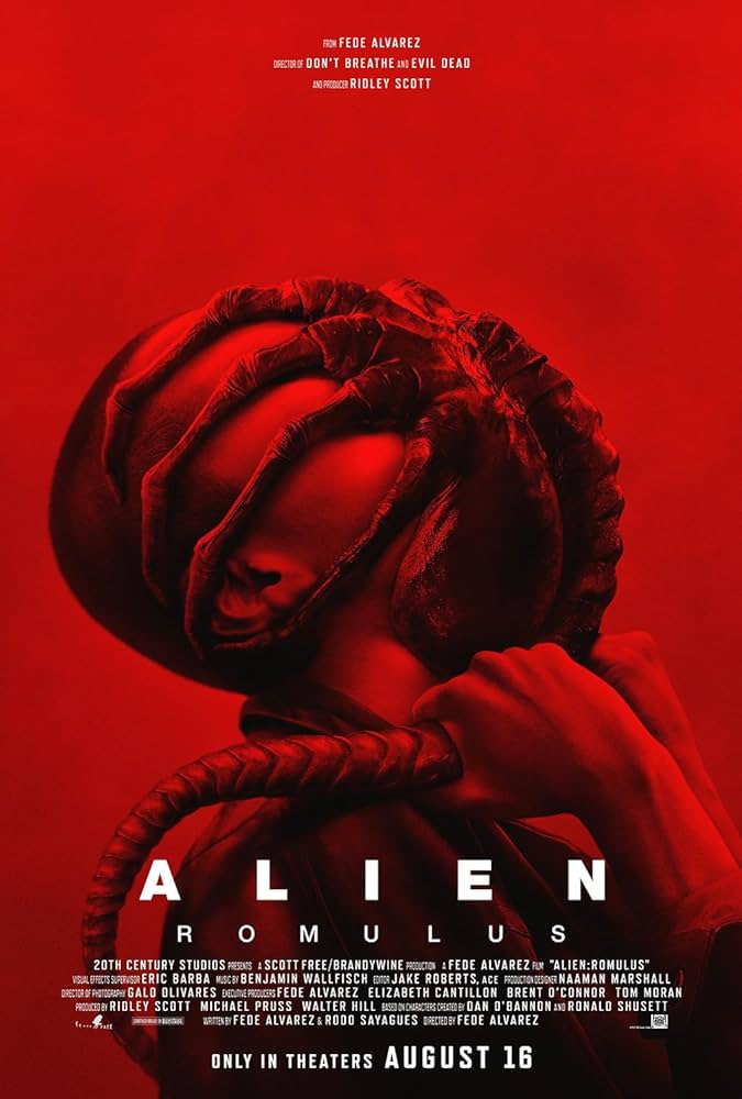
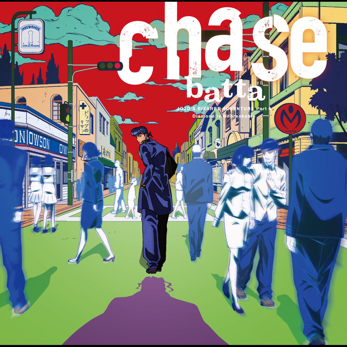
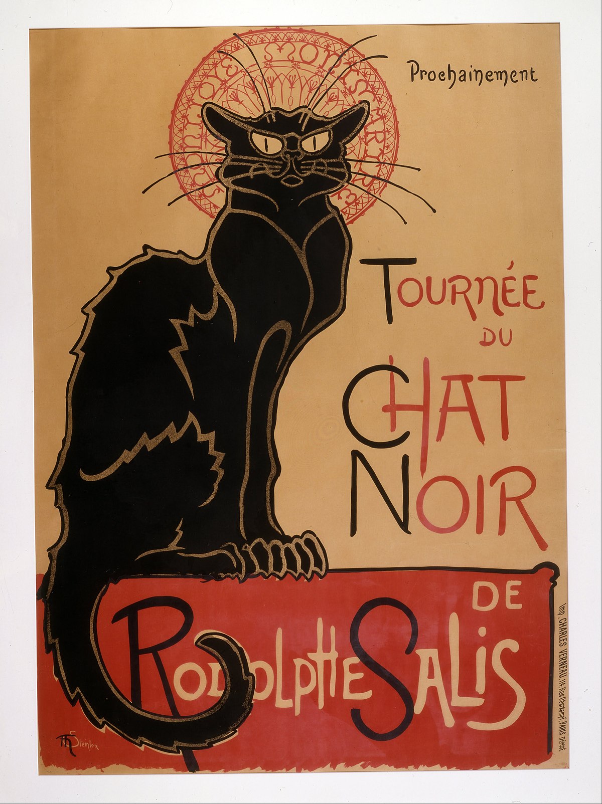
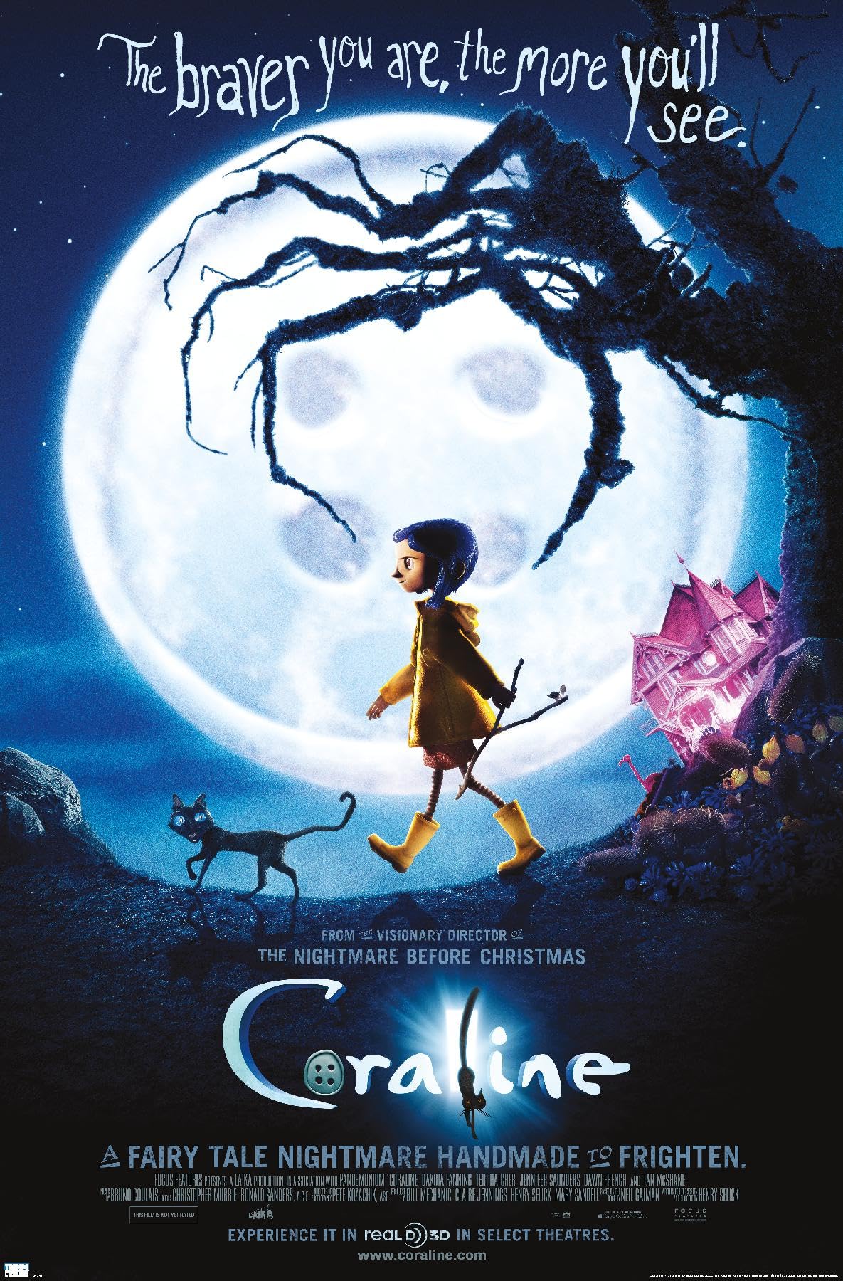
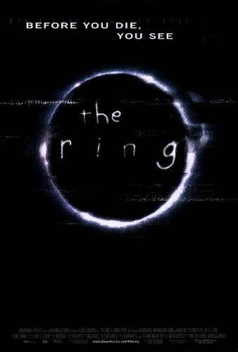
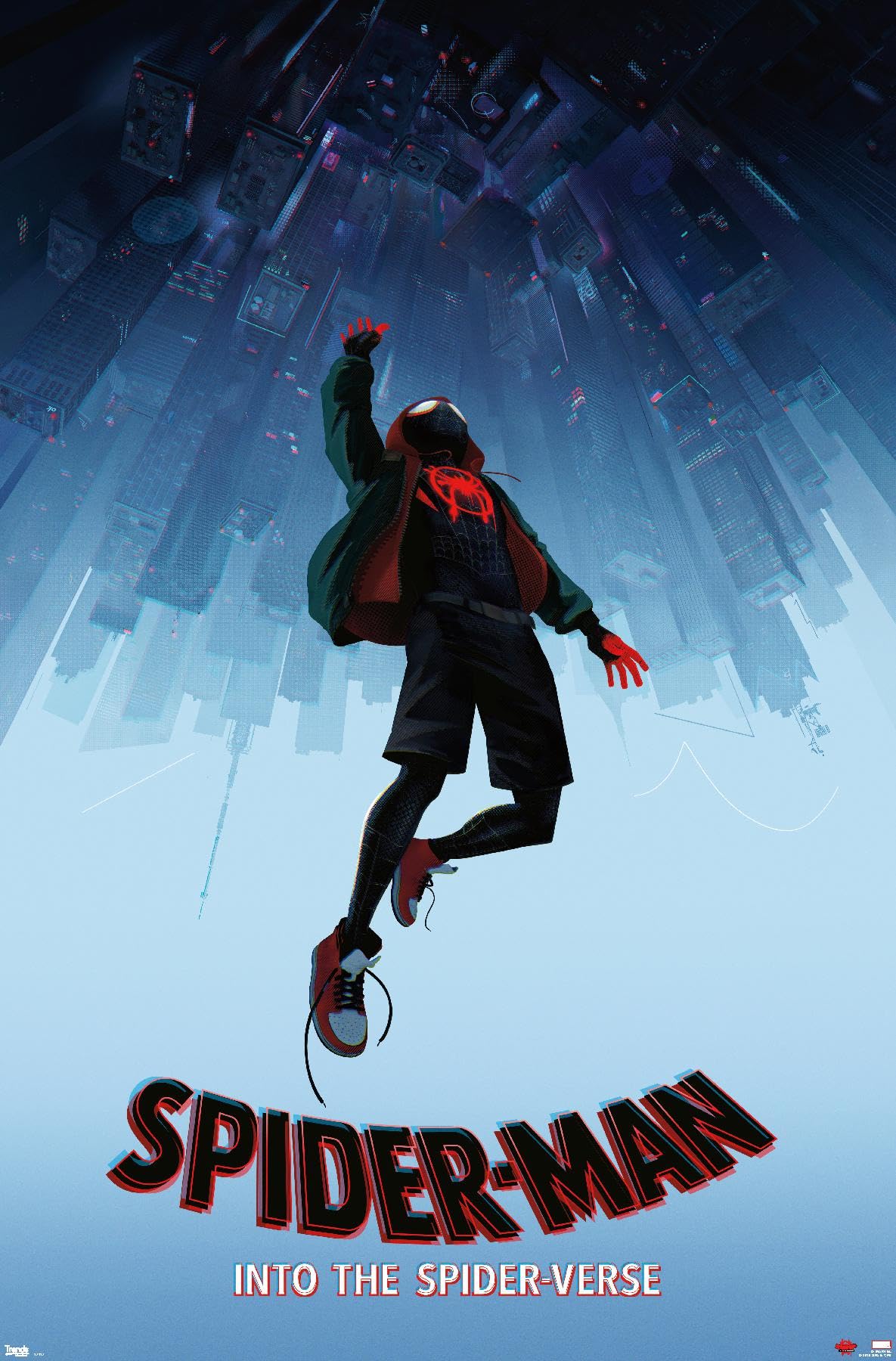
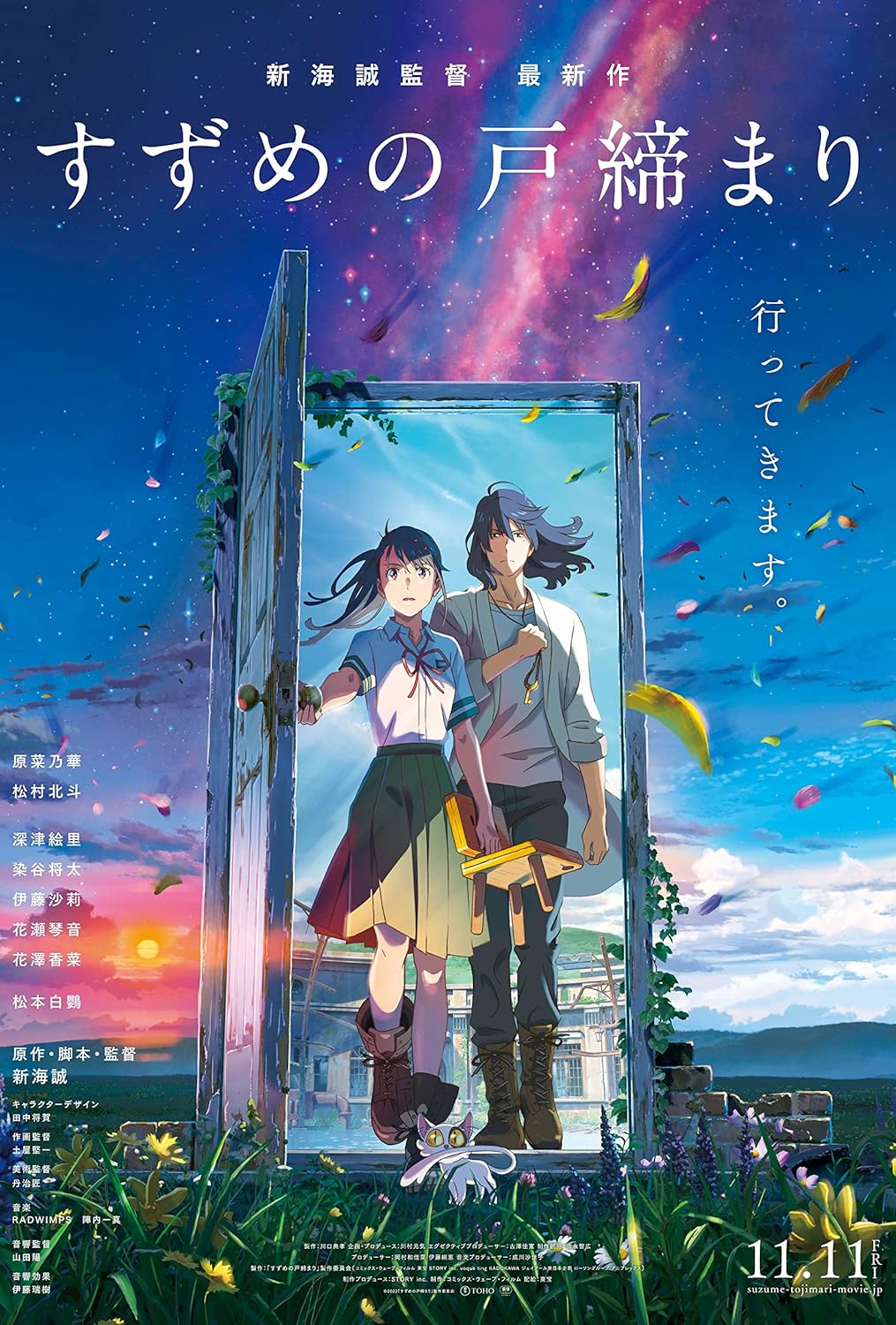
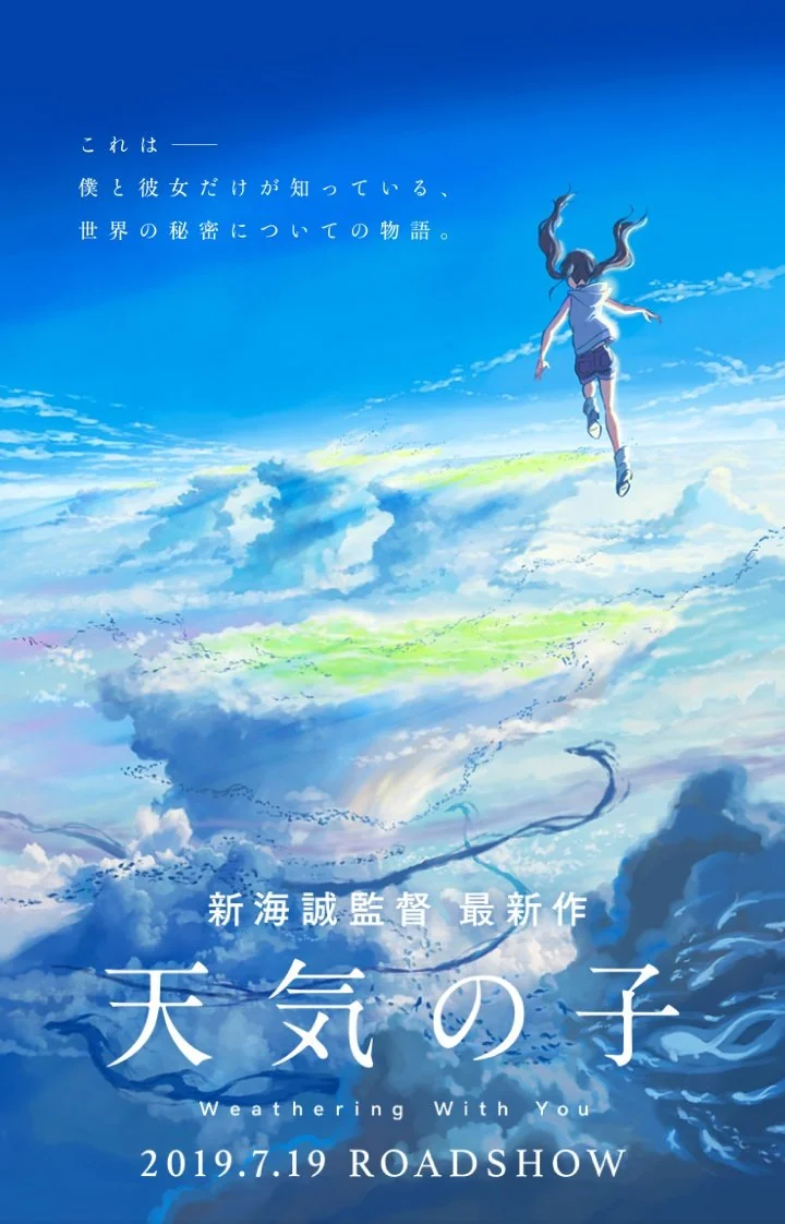
Inspiration
Here are my inspirations for this project:
Inspiration folder (Only accessible by WCSD emails)